How to Turn Your Website Into a Lead-Generating Machine 🚀

So, you finally launched your website (yay!) or maybe you’ve had one for a while now… but it’s just kind of sitting there. Like a wallflower at prom. Sure, it looks cute, but is it actually doing anything? Is it bringing in leads? Is it growing your email list? Is it helping your business make money while you sleep?
If the answer is “meh,” then keep reading—because we’re about to turn that digital wallflower into a lead-generating powerhouse.
First Things First: What Even Is a Lead?
Let’s get clear: a lead is someone who’s shown interest in your business. They’re not just browsing; they’re giving you their email, filling out a form, booking a call—basically saying, “Hey, I’m intrigued!”
Turning your site into a lead-generating machine means giving those people multiple, irresistible ways to raise their hands and say, “Tell me more.”
Ready to get into it? Here we go.
1. Nail Your First Impression (Like, Within 5 Seconds)
You’ve got a teeny tiny window to grab someone’s attention—literally just a few seconds. If your site is confusing, cluttered, or doesn’t instantly tell them who you are and what you do? Poof. They’re gone.
Quick Fixes:
Clear headline at the top of your homepage. Don’t be clever—be clear.
Subheadline that explains what you offer and who it’s for.
A visible call-to-action (CTA) button. No one should have to scroll or hunt for it.
Example
Custom Websites for Women-Owned Businesses That Want to Stand Out Online
Simple. Effective. You’ve told them what you do and what to do next.
2. Add Calls-to-Action Like Confetti 🎉
Most small business websites don’t have nearly enough CTAs. One sad little “Contact Us” button in the footer is not going to cut it.
You need multiple, well-placed CTAs throughout your site. Think of them as little nudges to keep visitors moving toward the next step.
Smart Places to Drop CTAs:
Top right of your navigation bar
End of each section on your homepage
Inside your blog posts
Pop-ups (used wisely!)
Your footer—yep, people do scroll down there
Pro Tip: Vary your CTAs. Try “Book a Free Call,” “Download the Guide,” or “Start Your Project”—different offers will appeal to different visitors.
3. Create a Lead Magnet That’s Too Good to Resist
Want someone’s email? Give them something amazing in exchange. A lead magnet is a freebie that solves a specific problem your audience has.
Think:
A checklist
A cheat sheet
A mini email course
A quiz (people love quizzes)
A short guide or toolkit
The Formula for a Killer Lead Magnet:
Solve a real problem your audience faces
Make it easy to consume (no 75-page PDFs)
Deliver instant value
Give it a punchy name (“The Website Launch Checklist” > “Free Download”)
Once your lead magnet is ready, plug it into your site like it’s the main character. Homepage banner, pop-up, blog sidebar, the works.
4. Use Pop-Ups, But Don’t Be Annoying
Look, we all have a love-hate relationship with pop-ups. But when they’re done right? They convert like crazy.
The key is timing and relevance.
Best Practices:
Use exit intent pop-ups (triggered when someone’s about to leave)
Keep them simple and scannable
Offer your lead magnet or a discount/code if you’re selling something
Don’t trigger them too soon (give people a moment to breathe!)
Example:
“Wait! Don’t leave empty-handed. Grab our Free Guide: 5 Website Fixes That Convert Visitors Into Clients.”
Boom. Instant value, right when they need it most.
5. Show Off That Social Proof ✨
People trust people. If you want your website to generate leads, sprinkle that social proof everywhere.
Think:
Testimonials
Reviews
Client logos
“As Seen In” press badges
Case studies with real results
This reassures your visitor: “Hey, other people have trusted this business—and had a great experience!”
Where to Use It:
Right after you introduce your service
Near your CTAs
On your About page
In your footer (yep, again!)
Boom. Instant value, right when they need it most.
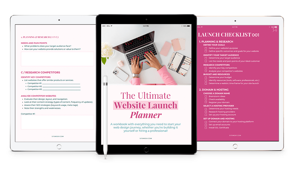
Free Download! The Ultimate Website Launch Planner
Download this free workbook with everything you need to start your web design journey, whether you’re building It yourself or hiring a professional!

6. Make Your Contact Form Not Boring
Want someone to get in touch? Make your form easy, friendly, and dare we say—fun.
Try This:
Replace “Submit” with something more exciting like “Let’s Chat” or “Send It!”
Keep the number of fields short—name, email, and message is plenty
Add personality to your form headers (“Got questions? Hit us up!”)
And don’t bury it 10 clicks deep. Your contact page should be linked in your main navigation and/or featured in your homepage CTA.
7. Offer Multiple Ways to Connect
Not everyone wants to fill out a form.
Some people prefer to:
DM you on Instagram
Send a quick email
Book a call right away
Make sure your site includes options. A booking link (hello, Calendly), social media buttons, a clickable email—all of these make it easier for someone to take the next step.
You can even add a chat widget if it fits your vibe. Just make sure it’s actually monitored!
8. Blog Strategically (Yes, Blogging Still Works)
Blogging is one of the best ways to get found on Google—and to warm up potential leads.
Here’s how it works:
Someone Googles a question
They find your helpful blog post
They love your voice + value
They download your lead magnet or book a call
Blog Tips
Write about your audience’s actual questions and problems
Include CTAs in your posts (don’t be shy!)
Link to your services
Make your posts easy to scan with subheadings and bullet points
9. Make It Mobile-Friendly (Non-Negotiable)
Over half of your visitors are likely on mobile. If your site looks wonky or loads slow on their phones, they’re not going to bother filling out your form.
Use big buttons, clean layouts, and text that’s readable without zooming. Check your forms, pop-ups, and CTAs on mobile to make sure everything works like a dream.
10. Track What’s Actually Working (and Tweak It!)
You don’t have to guess what’s working—you can track it.
Install Google Analytics (or something like Fathom or Plausible if you want something simpler) to see:
- Where your traffic comes from
- Which pages people visit most
- What your conversion rates are
Try different CTA buttons, lead magnets, or pop-up wording. Sometimes a tiny change (like saying “Get My Free Guide” instead of “Submit”) can make a big difference.
Bonus: Make It About Them—Not You
This might be the most important tip of all.
Your visitors are asking one thing: “What’s in it for me?”
So don’t make your site all about your resume or your process or your history. Instead:
Talk about how you help
Focus on their pain points
Highlight the results you can get them
Show what their life/business could look like after working with you
Because at the end of the day, that’s what will turn a casual browser into a high-quality lead.
The Wrap Up
Your website shouldn’t just be pretty—it should be powerful. With the right pieces in place, it can quietly (or not-so-quietly) work in the background to bring in leads while you focus on doing what you love.
Let’s recap:
- Make your site crystal clear
- Sprinkle calls-to-action like they’re glitter
- Give away something valuable
- Show off those happy clients
- Make it fun, friendly, and mobile-ready
When you treat your website like the lead-generating machine it can be, your inbox (and your business) will thank you.
Psst… need help turning your site into a lead-generating powerhouse? That’s kind of my thing. 😉
Free Download! The Ultimate Website Launch Planner
Download this free workbook with everything you need to start your web design journey, whether you’re building It yourself or hiring a professional!

Share:
You May Also Love...
Interested in Custom Web Design Services?


