How to Design a Website That Sells (Without Feeling Salesy)
Let’s be real: most of us don’t love being “sold to.” Pushy popups, flashing BUY NOW buttons, and endless “limited time offers” can feel more like red flags than reasons to say yes.
But here’s the thing—your website should sell.
Not in a sleazy, used-car-lot way. In a confident, helpful, strategically designed way that builds trust, guides visitors, and makes the decision to work with you feel easy and obvious.
Whether you’re a service provider, a coach, a boutique shop owner, or a creative entrepreneur, your website is one of your most powerful sales tools. When done right, it can sell for you 24/7—without sounding like a late-night infomercial.
Here’s how to design a website that actually sells (without feeling salesy).
1. Start with Trust, Not a Pitch
Before anyone’s going to hire you, book with you, or buy from you—they have to trust you. And trust doesn’t come from shouting your offer. It comes from clarity, consistency, and credibility.
Here’s how to build trust through design:
• Make your message clear
Within five seconds of landing on your site, a visitor should know exactly who you are, what you do, and who you do it for. Don’t make them scroll to figure it out. Your headline, subhead, and hero section should work together to say, “You’re in the right place.”
• Use real photos and thoughtful design
Stock images can work, but custom photography instantly adds authenticity. Pair it with design that feels elevated and on-brand, and suddenly your business feels trustworthy, professional, and real.
• Highlight social proof
People believe people. Sprinkle in testimonials, logos of past clients, short success stories, or even screenshots of real messages you’ve received. If others trust you, new visitors are more likely to do the same.
2. Understand the Buyer Journey (and Design Around It)
A successful website isn’t just a pretty collection of pages—it’s a path. Every scroll, every section, every click should help a visitor move from “just browsing” to “take my money.”
Let’s break it down:
Awareness → Interest → Consideration → Decision
Your site should guide people through those stages. That means:
- Give people a reason to stay (helpful content, clear headlines, friendly vibes)
- Show them how you solve their problem (benefits, not just features)
- Make it easy to take the next step (strategic CTAs and intuitive navigation)
And remember: not everyone’s ready to buy on their first visit. Your site should give them easy ways to stick around (email signup, lead magnet, blog post, etc.).
3. Use CTAs That Invite, Not Pressure
A CTA (Call to Action) doesn’t have to shout. In fact, the best CTAs feel like helpful nudges, not demands.
Examples of high-converting, non-pushy CTAs:
“Let’s chat” (instead of “Book now!”)
“See how it works” (instead of “Buy today”)
“Download your free guide” (instead of “Enter your email NOW”)
It’s not about the exact words—it’s about the tone. Match your CTAs to the mindset of your audience. Someone new to your brand probably needs a softer ask than someone who’s already followed you for a year.
Pro tip: Add CTAs throughout the page, not just at the bottom. Think of them as gentle hand-raisers that say, “Ready when you are.”
4. Design for Skimmers (Because Everyone Is One)
People don’t read websites like novels. They skim. They scroll. They scan for keywords and visual cues.
Your job? Make it easy for them.
Skimmer-friendly design tips:
Break up text into short paragraphs
Use headers to introduce each new idea
Add bullet points for quick info
Keep contrast strong (dark text on a light background = always a win)
Use plenty of white space so nothing feels cramped
Think of your website like a well-organized closet: everything has a place, and it’s easy to find what you’re looking for.
5. Make It Ridiculously Easy to Say “Yes”
Let’s talk about friction. Friction is anything that makes it harder for someone to take action. And nothing kills conversions faster.
Common website friction points:
Long, confusing contact forms
No pricing info or timeline expectations
Hard-to-find buttons
Slow load times
Non-mobile-friendly layouts
Unclear next steps
Eliminate every ounce of friction you can. If someone wants to work with you or buy from you, your site should say “Absolutely—here’s how” in the simplest way possible.
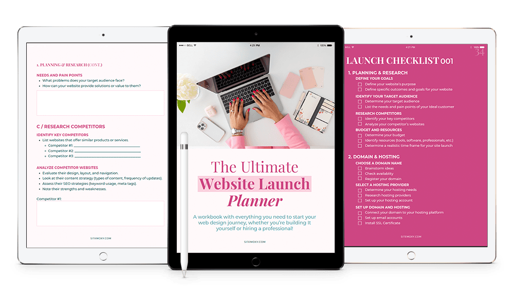
Free Download! The Ultimate Website Launch Planner
Download this free workbook with everything you need to start your web design journey, whether you’re building It yourself or hiring a professional!
6. Let Your Personality Lead
People buy from people. And the #1 way to make your website not feel salesy? Be yourself.
Inject your voice into your copy. Choose visuals that reflect your vibe. Write like you talk. (Seriously, “authentic tone” converts better than robotic marketing speak every time.)
If you’re sarcastic, let that shine. If you’re warm and nurturing, lean into it. If you’re a total boss, own it.
Selling is just helping someone make a decision. When your personality comes through, it feels like a conversation—not a pitch.
7. Be Strategic With Your Homepage Layout
Think of your homepage as a welcome party, a handshake, and a tour guide all in one. It should introduce your brand, answer key questions, and direct traffic to the next best step.
Here’s a high-level layout that sells:
Hero section – Who you are and what you do (with a clear CTA)
Short intro/about – What makes you different
Services preview – Tease your offers with links to learn more
Social proof – Testimonials, reviews, or media mentions
Featured content – A blog post, lead magnet, or quick video
CTA section – Invite them to work with you or book a call
This flow builds interest without overwhelming. It’s clear, inviting, and purpose-driven.
8. Use Design Elements That Subtly Sell
Good design doesn’t just look nice—it guides behavior. Here’s how to do that subtly and strategically:
Use directional cues like arrows or images looking toward your CTA
Highlight benefits in bold or colored blocks
Design your CTA buttons to stand out but still feel on-brand
Stick with one or two main CTAs per page—don’t give too many choices
Use sticky headers or floating buttons for mobile users
Every design choice should help the user move forward with confidence.
9. Focus on Value, Not Just Features
This is where a lot of websites fall flat—they list what they offer, but not why it matters.
Here’s a quick reframing example:
❌ “Weekly 1:1 coaching calls”
✅ “Weekly coaching calls to keep you focused, accountable, and moving forward”
The second one sells because it connects a feature to a benefit. Do this throughout your site copy, and you’ll instantly feel more compelling (and less pushy).
10. Build for the Long Game
A good website doesn’t just convert cold leads today. It builds long-term trust and brand loyalty.
That means thinking beyond the immediate sale. Offer value. Share insights. Invite connection. Nurture your audience through content, email, or social.
Because when you do that? You’re not selling—you’re serving. And that kind of experience does sell… over and over again.
The Wrap Up
Designing a website that sells isn’t about being slick or manipulative. It’s about being clear, helpful, confident, and intentional.
You’re solving a real problem. You’re offering real value. So let your website show that—through thoughtful layout, smart CTAs, trust-building content, and a tone that feels so you.
And if you’re ready for a site that actually works as hard as you do?
Let’s build it together. ✨
Psst… need help turning your site into a lead-generating powerhouse? That’s kind of my thing. 😉
Free Download! The Ultimate Website Launch Planner
Download this free workbook with everything you need to start your web design journey, whether you’re building It yourself or hiring a professional!
Share:
You May Also Love...


Interested in Custom Web Design Services?