How to Create a Landing Page That Converts

Ready to create a landing page that doesn’t just look pretty but turns visitors into customers? You’ve come to the right place! Your landing page is like a virtual handshake; it’s the first impression your audience will get, and you want it to make them stick around long enough to take action. Whether you’re selling products, building your email list, or getting people to book a service, a well-optimized landing page can make all the difference.
But here’s the deal—creating a landing page that converts isn’t about slapping together some text and pretty images. It’s an art (with a bit of science mixed in). So let’s dive into how you can craft a landing page that not only attracts attention but also gets results. By the end of this, you’ll have everything you need to make a landing page that converts like crazy.
1. Start with an Attention-Grabbing Headline
Your headline is the first thing people will see when they land on your page. And guess what? They’re going to decide whether they stay or bounce within seconds. No pressure, right? Your headline needs to grab their attention instantly and give them a reason to keep scrolling.
Here’s a quick formula for a killer headline: “Get [desired outcome] without [undesired action or consequence].”
This is powerful because it speaks directly to what your audience wants while addressing their biggest pain points. Let’s break it down with a few examples:
- “Get in Shape Without Spending Hours at the Gym.”
- “Boost Your Website Traffic Without Wasting Money on Ads.”
- “Build a Gorgeous Website Without Any Coding Skills.”
The goal here is to immediately communicate the value you’re offering and why it matters to them. Keep it short, direct, and compelling. If your headline doesn’t clearly explain what you do and why someone should care, you’ll lose them faster than a cat losing interest in a toy mouse.
SEO Tip: Use relevant keywords in your headline. If your product or service revolves around “custom websites” or “digital marketing tools,” make sure those terms are in the headline to help with search engine optimization (SEO).
2. Create a Subheading That Adds Value
Once your headline has hooked them, a subheading is your next chance to really reel them in. The subheading should give more context to the headline, explain the benefits, and motivate your visitors to keep scrolling. You want your subheading to do two things:
- Expand on the promise of the headline.
- Provide a clear next step (whether that’s reading more, signing up, or purchasing).
For example:
- Headline: “Boost Your Website Traffic Without Wasting Money on Ads.”
- Subheading: “Our easy-to-use SEO toolkit helps you rank higher on Google without spending a fortune on paid ads. Try it free for 14 days!”
The subheading adds a bit more depth, giving the visitor an idea of what’s in it for them while nudging them toward the next action.
3. Keep It Clean: Design Simplicity Is Key
Your landing page’s design should be clean, professional, and focused. You don’t want to clutter it with distractions. Less is more when it comes to effective landing page design.
Here’s what you need to remember:
- White space is your friend. Don’t cram everything above the fold. Give your elements room to breathe so the most important aspects of your page can stand out.
- Use a clear, readable font. Skip the fancy, hard-to-read fonts. Your text should be legible, both on desktop and mobile.
- Choose a simple color scheme. Stick with 2-3 main colors that align with your branding and make sure your call-to-action (CTA) buttons stand out.
Speaking of CTAs…
4. Call to Action (CTA): Make It Unmissable
Your CTA is arguably the most important part of your landing page. This is where you tell people exactly what you want them to do. Want them to sign up for a newsletter? Buy a product? Book a free consultation? Whatever it is, your CTA needs to be clear and impossible to miss.
Here’s how to nail your CTA:
- Use action-oriented language. Instead of “Submit” or “Learn More” (yawn), try something like “Get Started Today,” “Claim My Free Trial,” or “Show Me How to Save Time.”
- Make it visually stand out. The CTA button should pop off the page. Use a contrasting color to make it easy to find, and place it in a prominent spot above the fold (and sprinkle it throughout the page too).
- Keep it simple. Don’t ask for too much. If you’re collecting leads, don’t bombard them with a 10-field form. Stick to the essentials like name and email.
Pro Tip: For extra conversions, use multiple CTAs throughout the page. If your landing page is long, don’t make people scroll back to the top. Repeat your CTA at different intervals.
5. Focus on Benefits, Not Features
Let’s get real for a second. People don’t care about the features of your product or service. They care about the benefits—how it’s going to improve their lives, solve their problems, or make them feel like a superhero. So, instead of listing a bunch of features that could sound technical or boring, focus on the results.
For example, let’s say you’re selling an email marketing tool. Don’t just say, “Our tool has automated workflows.” Instead, say, “Save hours of time each week by automating your email campaigns, so you can focus on what you love—growing your business.”
Always put yourself in your audience’s shoes. How does your product or service make their life easier, better, or more fun?
SEO Tip: When listing benefits, make sure to incorporate key search terms. This helps Google understand what your page is about and boosts your chances of ranking higher.
6. Use High-Quality, Relevant Images or Videos
A picture is worth a thousand words, and on a landing page, a picture could also be worth thousands of conversions. Your visuals should reinforce the message of your page and showcase your product or service in the best possible light. A great image or video can often do more to communicate your message than text alone.
But here’s the catch: the visuals need to be high-quality and relevant. No stock photos that look cheesy or generic! Opt for real images of your product, or even better, videos of it in action.
- For products: Show the product from multiple angles, or include a demo video.
- For services: Use lifestyle shots or videos that showcase happy customers, or show behind-the-scenes clips of how you work.
Pro Tip: Make sure your visuals are optimized for fast loading times. Large, unoptimized images can slow down your landing page, and a slow page will send visitors running for the hills.
7. Add Social Proof: Show That Others Love You
Social proof is the secret sauce of landing pages that convert. People trust what other people say about your product more than what you say. That’s why adding testimonials, reviews, or even logos of companies that have used your services can make a big difference.
Here’s how to incorporate social proof:
- Testimonials: Pick a few real, detailed testimonials that show specific results. Instead of “This product is great!” you want something like “After using this tool, our website traffic increased by 50% in just 3 months.”
- Case studies: If you’ve helped clients achieve great results, turn those stories into a case study and link it on the landing page.
- Logos or trust badges: If you’ve worked with well-known brands, add their logos to your page. You can also include trust badges like “Featured on…” or “500+ happy customers.”
SEO Tip: Use schema markup to display star ratings from reviews, which can improve your click-through rate from search results.
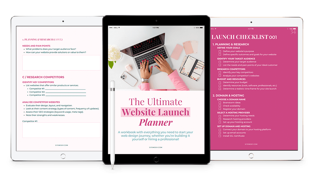
Free Download! The Ultimate Website Launch Planner
Download this free workbook with everything you need to start your web design journey, whether you’re building It yourself or hiring a professional!

8. Remove Distractions: Keep the Focus on Converting
Your landing page has one goal: to get visitors to convert. Anything that doesn’t serve that goal is a distraction. That means no unnecessary links, no navigation menus, and no sidebars.
Keep your landing page focused and single-minded. Every element should guide the visitor toward the CTA. If something doesn’t help with that, get rid of it!
Here are a few things you can safely eliminate:
- Navigation menus: You don’t want people wandering off to other parts of your site.
- External links: Keep everything self-contained. If you need to add additional resources, consider linking to them after the visitor has converted.
- Excessive text: Keep your copy punchy and to the point. No one wants to wade through paragraphs of fluff.
9. A/B Test to Optimize Conversions
Even after you’ve created what feels like the perfect landing page, your work isn’t over. A/B testing is key to finding out what really works and maximizing your conversions.
Here’s what you can test:
- Headlines: Test different headlines to see which one grabs more attention.
- CTA button color and copy: Even small changes, like switching from “Get Started” to “Start My Free Trial,” can impact your conversion rate.
- Visuals: Test different hero images or videos to see which one resonates more with your audience.
- Page length: Some audiences prefer shorter pages, while others like more information. Test both!
Use tools like Zoho or Optimizely to set up and track your A/B tests, and make data-driven decisions to improve your conversions. From headlines to visuals, every tweak can lead to better results.
10. Make It Mobile-Friendly (Non-Negotiable!)
If your landing page isn’t mobile-friendly, you’re leaving conversions on the table. Over half of web traffic now comes from mobile devices, so your landing page must look and function beautifully on phones and tablets. Google also ranks mobile-optimized sites higher in search results—so if SEO is a goal, this is crucial.
Here’s how to ensure your page looks great on mobile:
- Responsive design: Make sure your landing page automatically adjusts to different screen sizes. Test it on various devices to check for formatting issues or misaligned text.
- Streamlined content: On mobile, less is more. Trim down unnecessary content and make sure your CTA is easy to find without excessive scrolling.
- Button size: Your CTA buttons need to be thumb-friendly. Make them large enough to tap easily on a small screen without zooming in.
- Load speed: Mobile users are even less patient than desktop users. Ensure your page loads quickly by compressing images and minimizing scripts that slow things down.
11. Include a Guarantee or Risk-Free Offer
People are naturally hesitant to make decisions online, especially if they’re unfamiliar with your brand. Adding a guarantee or risk-free offer can help ease that fear and get them to take the plunge. A money-back guarantee or a free trial reduces the perceived risk and boosts trust.
For example, if you’re selling a service, offer a “14-day free trial, no credit card required.” If you’re selling a product, consider a “30-day money-back guarantee.” This reassures potential customers that they won’t lose anything by trying your offer.
12. Use Urgency and Scarcity to Drive Action
Creating a sense of urgency can nudge visitors toward action. If they think they have all the time in the world to decide, they’ll likely put it off. By adding a little time pressure or scarcity, you can encourage them to act now instead of later.
Some ways to add urgency:
- Limited-time offers: “Get 20% off today only!”
- Countdown timers: This visually reinforces urgency and creates a sense of anticipation.
- Limited availability: “Only 10 spots left!” or “Offer valid for the first 100 signups.”
Just be sure your urgency is genuine. If visitors come back tomorrow and see the same countdown or offer, they’ll feel misled.
13. Use Clear, Simple Forms
If your landing page requires a form (for lead generation, sign-ups, etc.), keep it simple. The longer the form, the more friction you’re adding to the conversion process. People don’t want to spend 10 minutes filling out a questionnaire just to get a freebie or sign up for a newsletter.
Here’s how to optimize your forms:
- Keep it short: Ask for only the most essential information. In most cases, a name and email will do. You can always gather more data later.
- Use autofill: Make it easy for users by enabling autofill, so they don’t have to type out every detail manually.
- Single-column layout: Forms that stack vertically are easier to fill out on both desktop and mobile.
14. Don’t Forget SEO (Search Engines Love Landing Pages Too!)
It’s not just people who need to love your landing page—search engines do, too. A well-optimized landing page can rank higher on Google, driving organic traffic without the need for paid ads.
Here’s how to optimize for SEO:
- Target keywords: Use relevant keywords throughout your landing page, including the headline, subheading, and body text. But don’t overdo it—keep it natural.
- Meta descriptions: Write a compelling meta description (like the one we created earlier!) to improve your click-through rates on search engine results pages.
- Alt text for images: Add descriptive alt text to your images to help them show up in search results and improve accessibility.
- Fast loading speed: Use tools like Google PageSpeed Insights to ensure your page loads quickly, as this is a ranking factor for SEO.
By following these SEO best practices, you’ll increase the chances of your landing page showing up when people search for your product or service.
The Wrap Up
So, there you have it—a comprehensive guide to creating a landing page that converts like a pro. From compelling headlines to irresistible CTAs, and from sleek designs to strategic social proof, you’ve got all the tools you need to build a page that gets results.
Let’s recap the key points:
- Headline: Grab attention and promise a desirable outcome.
- Subheading: Add more context and highlight the benefits.
- Design: Keep it clean, simple, and focused.
- Call-to-Action (CTA): Make it bold, action-oriented, and impossible to miss.
- Benefits over features: Show how your product or service improves lives.
- Social proof: Build trust with testimonials, case studies, or reviews.
- Mobile-friendly: Optimize for mobile, or lose out on half your traffic.
- A/B testing: Keep refining your page to improve conversions.
- SEO: Optimize your page for search engines to drive organic traffic.
With these steps, you’ll turn your landing page into a conversion powerhouse. Now go out there and start building the landing page of your dreams!
Ready to Create a Landing Page That Converts?
If you’re ready to take action and build your own high-converting landing page, it’s time to get started. Whether you’re using tools like WordPress, Squarespace, or Shopify, these principles apply to any platform. Need more tips or a landing page template? Check out our blog for more guides on how to master the art of conversion.
Good luck, and may the conversions be ever in your favor!
If you need help along the way, you know where to find me. 😉
Free Download! The Ultimate Website Launch Planner
Download this free workbook with everything you need to start your web design journey, whether you’re building It yourself or hiring a professional!

Share:
You May Also Love...
Interested in Custom Web Design Services?


