21 Common Mistakes to Avoid When Building Your Own Website

Building your own website can feel like an exciting adventure, especially if you’re tackling it DIY-style. It’s a chance to unleash your creativity, build your brand, and craft a digital space that represents your business or personal project. But let’s face it: building a website isn’t always as easy as dragging and dropping a few elements. Mistakes can creep in, and these missteps might scare away visitors, cost you sales, or make your site frustrating to use.
Here’s a fun, no-nonsense guide to the common pitfalls to avoid when building your own website. By steering clear of these mistakes, you’ll be on the path to a professional, user-friendly site that delivers results.
1. Skipping the Planning Phase
Why it’s tempting: You’re excited to dive in and start designing.
Why it’s a mistake: Without a solid plan, your website could end up feeling disorganized or missing key elements.
Pro tip: Before you start, map out your site’s structure. What pages will you need? What’s the purpose of your site? Who is your target audience? Sketch out a rough layout or flowchart to guide you.
2. Ignoring Mobile Responsiveness
Why it’s tempting: It’s easy to get caught up in how your site looks on a desktop.
Why it’s a mistake: More than half of web traffic comes from mobile devices. If your site doesn’t look or work well on a smartphone, you’re losing out.
Pro tip: Test your site on multiple devices as you build. Make sure buttons are big enough to tap, text is easy to read, and images load quickly. Most platforms like Squarespace, Shopify, or WordPress themes include responsive design—make sure you’re using it.
3. Overloading Your Site with Features
Why it’s tempting: “If one cool feature is good, then five must be amazing!”
Why it’s a mistake: Too many bells and whistles can slow down your site, confuse visitors, and hurt your SEO.
Pro tip: Stick to the essentials. A clean, functional design beats a cluttered mess every time. Avoid autoplay videos, unnecessary animations, and anything that makes your site feel heavy.
4. Using Unreadable Fonts
Why it’s tempting: Fancy fonts seem like a quick way to make your site stand out.
Why it’s a mistake: Hard-to-read fonts can make your content inaccessible and turn off visitors.
Pro tip: Choose fonts that are simple and professional. Pair a clean sans-serif font for headings (like Helvetica or Montserrat) with an easy-to-read serif font for body text (like Georgia or Times New Roman).
5. Neglecting Page Load Speed
Why it’s tempting: You don’t realize how critical speed is to user experience.
Why it’s a mistake: Slow-loading sites frustrate visitors and cause them to leave. Plus, search engines penalize sluggish websites.
Pro tip: Optimize your images before uploading them. Use tools like TinyPNG to reduce file sizes without sacrificing quality. Also, consider enabling browser caching and using a fast hosting provider.
6. Forgetting About SEO Basics
Why it’s tempting: SEO can feel overwhelming or unnecessary for a small site.
Why it’s a mistake: Without basic SEO, your site will be harder for potential visitors to find.
Pro tip: Focus on the basics:
- Use keywords in your page titles, meta descriptions, and headings.
- Add alt text to your images.
- Include internal and external links.
- Use an SEO plugin if you’re on WordPress, like Yoast or RankMath.
7. Ignoring Accessibility
Why it’s tempting: You might not think about how people with disabilities use your site.
Why it’s a mistake: Accessibility isn’t just a nice-to-have—it’s essential for inclusivity and often required by law.
Pro tip: Use contrasting colors for text and backgrounds, add alt text to all images, and make sure your site can be navigated using only a keyboard. Tools like Wave can help you audit your site’s accessibility.
8. Not Having a Clear Call-to-Action (CTA)
Why it’s tempting: You assume visitors will naturally figure out what to do next.
Why it’s a mistake: A site without clear CTAs leaves visitors confused and less likely to take action.
Pro tip: Decide what action you want visitors to take on each page (e.g., “Sign up for my newsletter” or “Buy now”). Make your CTAs prominent, specific, and enticing.
9. Using Too Many Colors
Why it’s tempting: You love color and want your site to feel vibrant.
Why it’s a mistake: A rainbow-colored site can look chaotic and unprofessional.
Pro tip: Stick to a cohesive color palette. Use 2-3 primary colors and a couple of neutrals. Tools like Coolors can help you create a polished palette.
10. Relying on Placeholder Text and Images
Why it’s tempting: It’s quicker to use “Lorem Ipsum” and stock photos during the design process.
Why it’s a mistake: Forgetting to replace them makes your site look unfinished and untrustworthy.
Pro tip:Create or source your content early in the process. Invest in quality copywriting and custom images to make your site feel authentic.
11. Skipping Analytics
Why it’s tempting: Tracking data might feel unnecessary or too technical.
Why it’s a mistake: Without analytics, you won’t know how your site is performing or where improvements are needed.
Pro tip: Install Google Analytics (it’s free!) or use your platform’s built-in analytics tools. Track key metrics like traffic, bounce rate, and conversion rates.
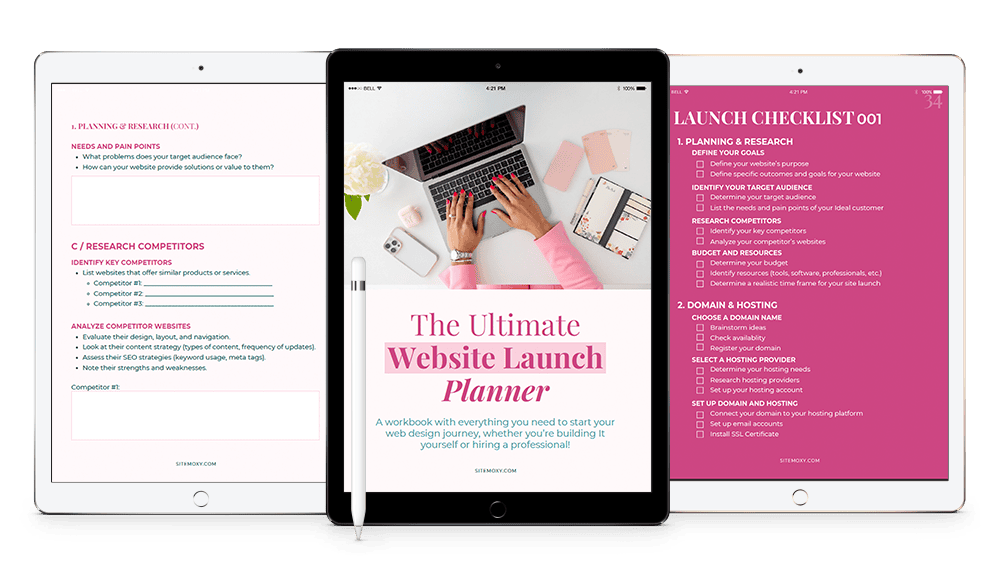
Free Download! The Ultimate Website Launch Planner
Download this free workbook with everything you need to start your web design journey, whether you’re building It yourself or hiring a professional!

12. Not Testing Your Site
Why it’s tempting: You assume everything works because it looks fine in the editor.
Why it’s a mistake: Broken links, buggy forms, or typos can ruin your credibility.
Pro tip: Test everything before launch. Click every link, fill out every form, and proofread every word. Better yet, have a friend or colleague review it for you.
13. Choosing the Wrong Hosting Provider
Why it’s tempting: Cheap hosting sounds like a great way to save money.
Why it’s a mistake: Poor hosting can lead to slow load times, frequent downtime, and limited support.
Pro tip: Research hosting providers before committing. Look for reliability, customer support, and scalability. Popular options include SiteGround, Bluehost, and WP Engine.
14. Using Non-Professional Images
Why it’s tempting: It’s quicker and cheaper to snap a few pics with your phone or grab free stock photos.
Why it’s a mistake: Blurry, irrelevant, or overused images can make your site feel amateurish.
Pro tip: Invest in professional photography or high-quality stock photos. Sites like Unsplash or Shutterstock are great for finding polished, unique images.
15. Not Updating Your Content Regularly
Why it’s tempting: After launch, you might feel like your site is “done.”
Why it’s a mistake: Outdated content makes your site look neglected and hurts your SEO.
Pro tip: Keep your site fresh with regular updates. Add new blog posts, update your portfolio, or refresh your homepage seasonally.
16. Relying Too Heavily on Pop-Ups
Why it’s tempting: Pop-ups are great for capturing emails or promoting deals.
Why it’s a mistake: Too many pop-ups can annoy visitors and drive them away.
Pro tip: Use pop-ups sparingly. Set them to appear only after a user has spent time on your site or scrolled a certain percentage down the page.
17. Forgetting Security
Why it’s tempting: You might assume your site isn’t big enough to be a target.
Why it’s a mistake: Cyberattacks can happen to any site, big or small.
Pro tip: Use strong passwords, enable SSL (look for “https” in your URL), and consider installing security plugins like Wordfence or Sucuri.
18. Underestimating the Power of Good Copywriting
Why it’s tempting: You focus all your energy on the design and slap some text in at the last minute.
Why it’s a mistake: Poorly written copy can confuse visitors and hurt conversions.
Pro tip: Write clear, engaging, and persuasive copy. Speak directly to your audience and highlight the benefits of your product or service.
19. Not Including Social Proof
Why it’s tempting: You might not realize how powerful reviews, testimonials, and case studies are.
Why it’s a mistake: Without social proof, visitors may hesitate to trust you.
Pro tip: Add customer testimonials, reviews, or case studies to your site. If you don’t have any yet, consider offering incentives for feedback.
20. Not Prioritizing User Experience (UX)
Why it’s tempting: You might be more focused on how your site looks than how it feels to use.
Why it’s a mistake: A beautiful site that’s hard to navigate will frustrate users and drive them away. Poor UX can mean confusing menus, too many clicks to find information, or unclear pathways to important actions (like purchasing or contacting you).
Pro tip: Put yourself in your visitors’ shoes. Test your site’s navigation—is it intuitive? Can users find what they need quickly? Simplify your menu, make buttons easy to spot, and design your pages with a clear hierarchy to guide visitors smoothly through your site.
21. Launching Without a Goal
Why it’s tempting: You just want to get your site live.
Why it’s a mistake: A site without a goal won’t deliver results.
Pro tip: Define your primary goal before launching. Whether it’s generating leads, selling products, or showcasing your portfolio, let your goal drive your design and content decisions.
The Wrap Up
Building your own website is no small feat, but it’s incredibly rewarding. By avoiding these common mistakes, you’ll set yourself up for a website that not only looks great but also works beautifully. Remember, the best websites are a blend of thoughtful design, great content, and user-friendly functionality.
So, roll up your sleeves, grab a cup of coffee, and get building—without the headaches. 🚀
If you need help along the way, you know where to find me. 😉
Free Download! The Ultimate Website Launch Planner
Download this free workbook with everything you need to start your web design journey, whether you’re building It yourself or hiring a professional!

Share:
You May Also Love...
Interested in Custom Web Design Services?


